Casino Tops Online (CTO) is a leading platform for online casino reviews, guiding users in selecting the best online casinos. Our goal was to enhance user journey transitions—specifically from Google to CTO and from CTO to partner sites—by addressing engagement, trust, and user experience principles. Refining these transition moments presents a crucial opportunity in an industry where user experience can make or break retention.
Challenge: Understanding User Experience Without Data
Unlike traditional UX design processes that rely on extensive user research, CTO faced a unique challenge: we lacked comprehensive data on user journeys due to logistical constraints. To navigate this, we adopted an alternative approach based on The Peak-End Rule, that people judge an experience largely based on two moments:
- The Peak – The most intense part of the experience.
- The End – The final impression left by the experience.
Since we could not precisely identify the peak of the user journey without extensive research, we focused on what we could control—the transitions—the beginning (Google to CTO) and the ending (CTO to partner sites). We aimed to create a more positive and memorable user experience by improving these moments.
Transition Points & Identified Issues
1. Transition from Google to CTO
Current Issue
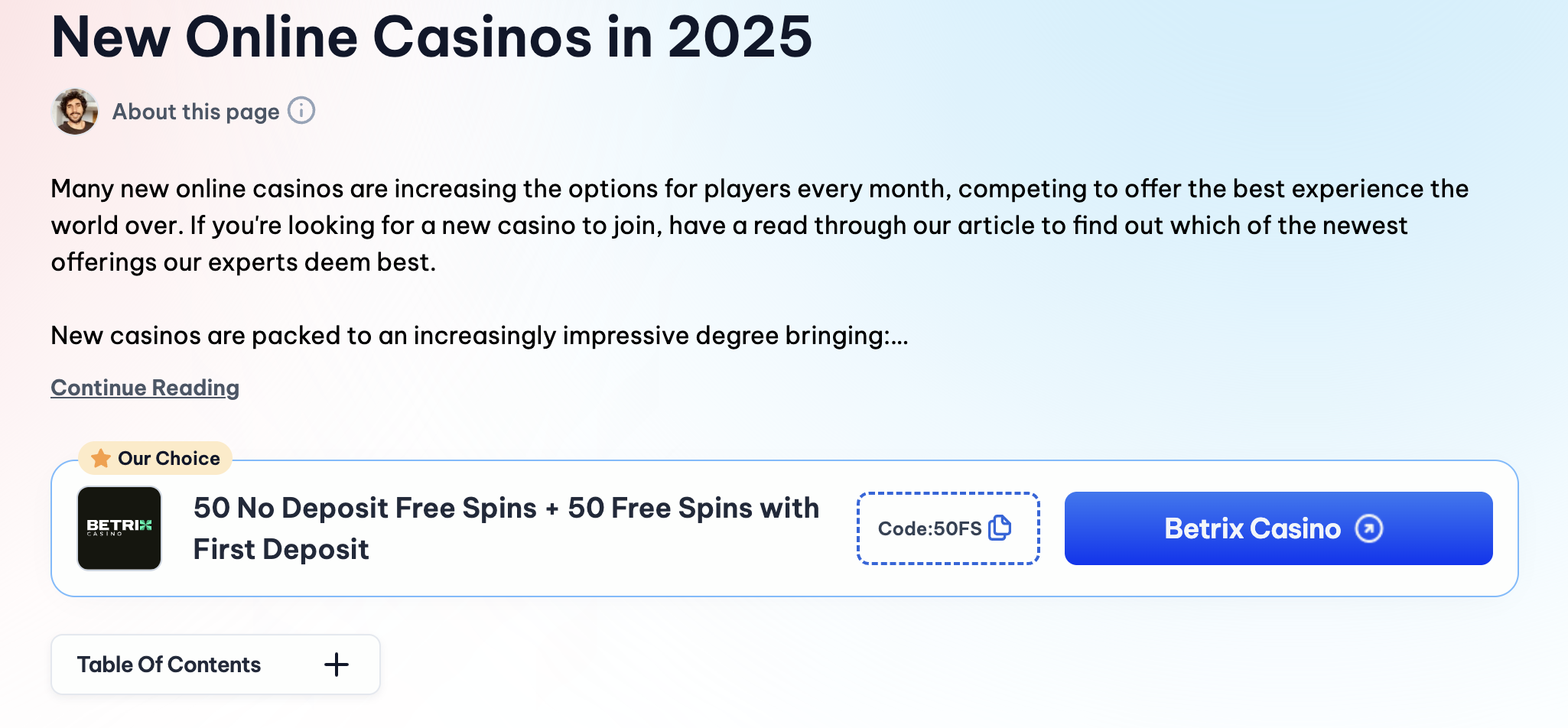
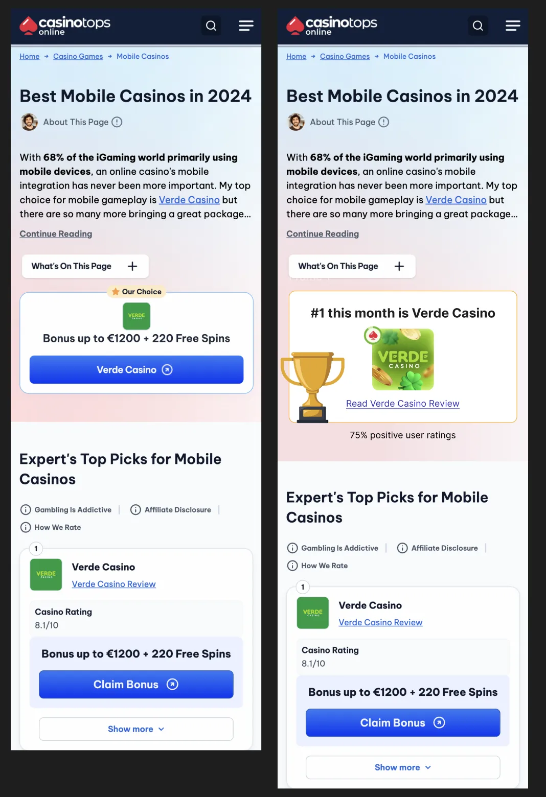
Users arriving from Google encountered an above-the-fold section that resembled an advertisement, urging them to claim a bonus. This design probably unintentionally triggers banner blindness, leading to disengagement and missed opportunities to communicate trust and value.
User Perception
- New visitors might overwhelmed or skeptical when met with an aggressive call-to-action.
- The structure provided no context as to why the bonus mattered or why CTO was a trusted source.
Proposed Solution
Redesign the above-the-fold section to function as an information hub rather than a sales pitch.
Actionable Steps:
- Reduce Banner Similarity: Remove sharp borders and minimize elements that resemble advertisements.
- Introduce Context: Lead with a welcoming message that sets the stage for credibility.
- Integrate Social Proof: Highlight real user ratings.
- Improve Call-to-Action: Replace aggressive "Claim Bonus" messaging with "Read Review," allowing users to engage at their own pace.
By aligning with user psychology—reducing cognitive overload and enhancing perceived credibility—we created an experience where users felt informed and in control rather than pressured.
2. Transition from CTO to Partner Site
Current Issue
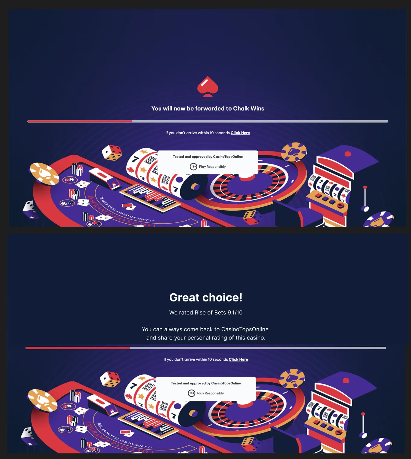
Once users clicked to visit a partner casino, they encountered a generic transition page stating that they were being forwarded. This lack of personalization made users feel abandoned, similar to a travel agent handing over a ticket without further acknowledgment.
User Perception
- Users felt detached from the CTO experience after clicking away.
- The transition page failed to reinforce their decision, leading to uncertainty about their choice.
- There was no emotional reason to return to CTO after visiting the casino.
Proposed Solution
Enhance the transition page to reassure users, reinforce trust, and provide an invitation to return.
Actionable Steps:
- Contextual Messaging: Display a personalized message based on the casino's rating.
- For high-rated casinos (8/10+): "Great Choice! We rated [Casino Name] 9.1/10!"
- For lower-rated casinos: "Have fun playing!" or "Stay cautious and play responsibly."
- Encourage Further Engagement: Invite users to return and rate their experience: "Share your review on CTO and help the community!"
By adding post-conversion reassurance, we transformed the transition page from a passive redirect to an engaging moment that strengthens brand recall and encourages repeat visits.
The Science Behind Our Approach
1. Cognitive Load & Banner Blindness
Users' cognitive resources are limited. The brain processes only a fraction of the available stimuli, prioritizing what seems relevant and filtering out the rest. This is why banner-like elements are often ignored. By reducing unnecessary distractions and structuring content with a clear hierarchy, we ensured users would engage with key information rather than unconsciously dismissing it.
2. Attention & Working Memory
Human working memory can hold approximately 5-9 chunks of information at any given time. Complex or overloaded interfaces force users to process too much at once, leading to disengagement. To optimize user experience, we simplified the interface and used familiar rating systems (leveraging social proof).
3. Norman's Three Levels of Design
- Visceral Design (First Impressions)
- Behavioral Design (Usability & Functionality)
- Reflective Design (Emotional Impact): Users remember how an experience made them feel. By ending interactions on a positive note with affirmations and encouragement, we create a lasting emotional connection that encourages return visits.
4. The Peak-End Rule in Action
By improving the start (Google to CTO) and end (CTO to partner), we increased the likelihood of users remembering a positive experience—even if the middle of their journey was less remarkable. This strategy aligns with psychological research showing that people's overall impression of an experience is disproportionately influenced by these two moments.